Slider
Creating Components


What is a Slider?
The Slider component enables you to create a slideshow with images, a text box and button for each image. We recommend using a maximum of four images so the Slider does not become too busy.
How to add an Slider
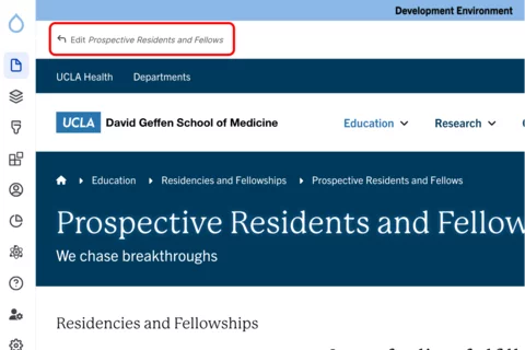
Click the edit link at the top of the page
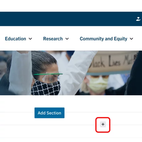
- Move your cursor where you want to place the component. (Add a section if needed).
Click the plus icon.
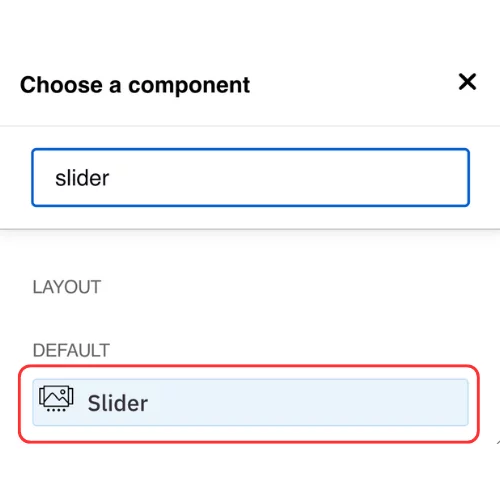
Select Slider from the menu
Content
- Add your first slide.
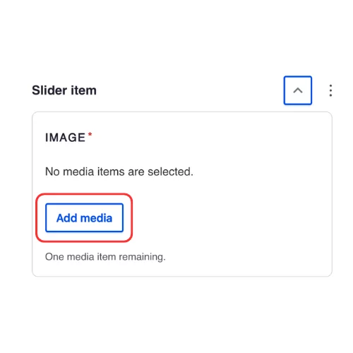
Click Add media in the Image Section.
- Select the appropriate image or upload the image to the Image Library.
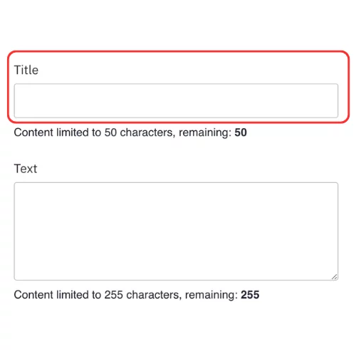
Recommended Image Dimensions: 21:9 - Maximum image size is 4MB Add a Title.
Add any additional information into the WYSIWYG Content Editor.
Note: Visit this page to learn more about how to use the WYSIWYG Content Editor.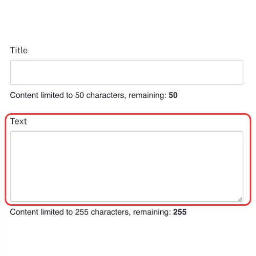
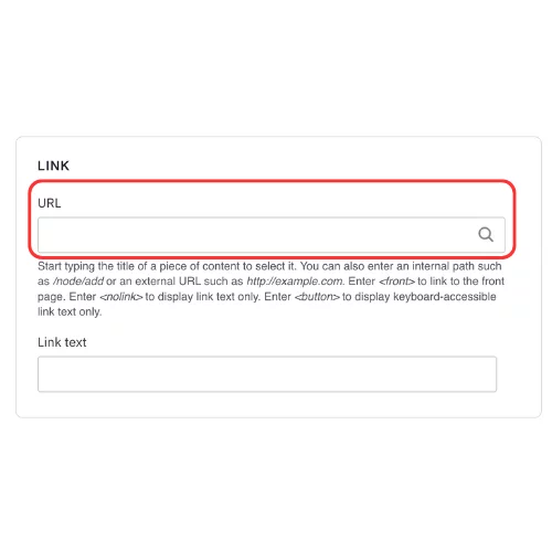
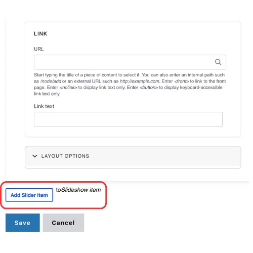
Add an internal page or external link (optional).
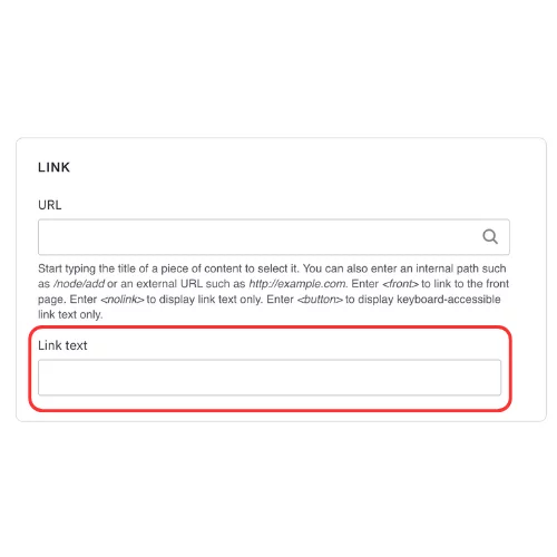
Add the Button text (optional).
Click Add slider item.
- Repeat steps 2 to 7 for each Slider.
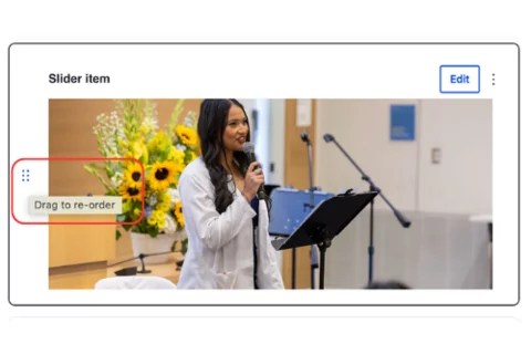
You can click on the all directions arrow and drag the Slider into the desired order.
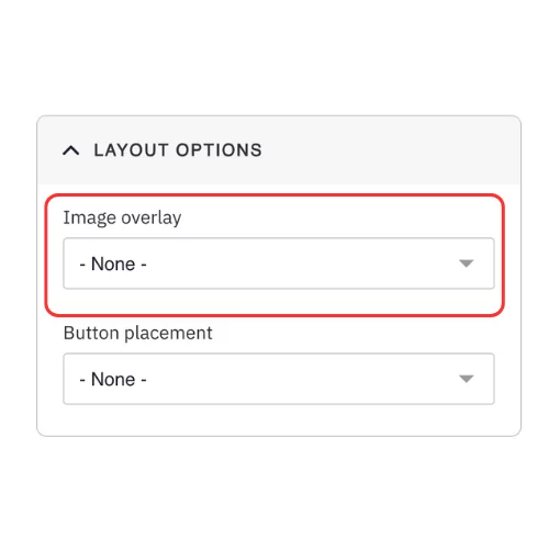
For the Image Overlay option, select No if you would like most of the text to appear below the image.
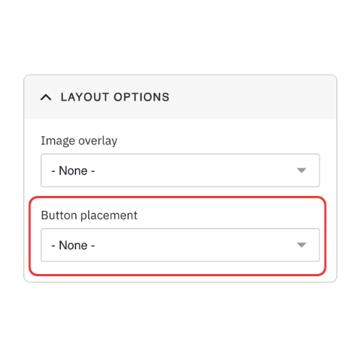
Select the Button placement if you added a button in Steps 6 and 7
Styles
Toggle to the Styles tab.
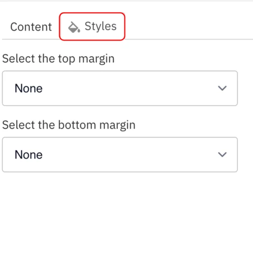
- Select the amount of additional space you would like above the component.
Select the amount of additional space you would like below the component.
Note: By default, there is no space below a component.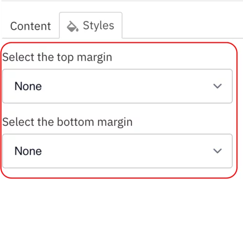
Save
- Click Save.
Scroll to the top of the page and click Save.
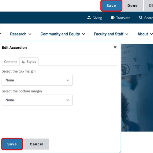
Click the Done button beside the save button.
Note: This will display the page in the closest representation of how site visitors will view it. All links and actions that are disabled in editing mode will be functional now.

Style options
- Layout Options settings used to create this component are: Image overlay: None, Button placement: None
- Layout Options settings used to create this component are: Image overlay: No, Button placement: Top
- Layout Options settings used to create this component are: Image overlay: Yes, Button placement: Bottom